Step 1. Detect problems
When the company asked about Redesign of their website, after my first review on their website I could understand what is critical issues - I was confused what the company is doing (differances of What I heard from marketing manager and What I get the information from website) and also the the user journey flow and UI was not smooth enough.
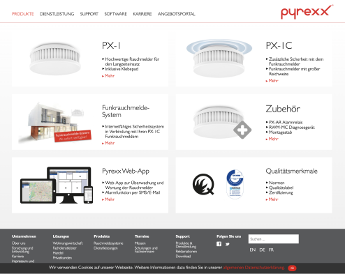
Actually the company provides thier own products (2 different types of smoke alarm) and housing services (graffiti removal, water analize, and smoke alarm services).during first meeting with Marketing manager (Katie) I detected problems.
1. Contents balance, beweeten smoke alarm and housing services.
2. Most audiences associate smoke alarms with services. In fact, these two contents are provided separately by the company.
3. Pretty old school UI. Connection to Quotation portal.Hidden to click (end of Prodct/Service detail page)
4. Connection to Quotation portal. Hidden to click.
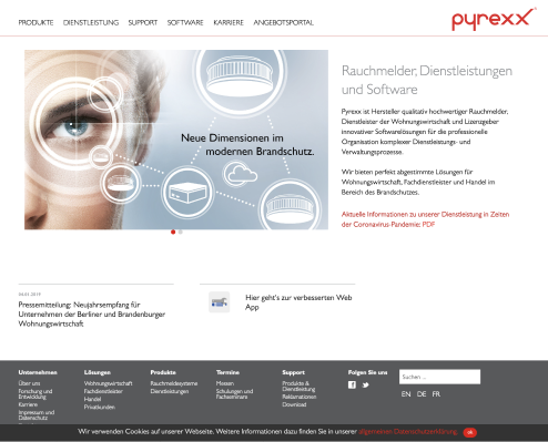
Website look (2018-2020)
Step 2. Requirments
During meeting with marketing manager, we discuss about Business- / Design strategy.
1. Why company needs a website?
2. Something different approach was this, Sales team will lead the audience to our website (via initial email/Phone call/Tradeshow) it means, I do not need to consider about landing pages / SEO part.
3. User journey has to be ended-up on “Quotation portal” from website.
4. Company plans for 5 years.
5. Visual consistency of Website and other company's portal.
6. DE version first.
7.Responsive design for Mobile - Wordpress platform.
Visual keywords for wbesite were
1. Modern
2. Friendly / Clean / Boldness
3. new CI needed
Step 3. Information architecture : Old vs New
Based on old sitemap, I started re-structured site map. and also I made check list which I have to concern from start to end of redesign process.
1. Collect all menu Items and Group them.
2. Most audiences associate smoke alarms with services. In fact, these two contents are provided separately by the company.
3. Pretty old school UI.
4. Connection to Quotation portal. Hidden to click (end of Prodct/Service detail page)
Site map - a part of old version of website, Excel file.
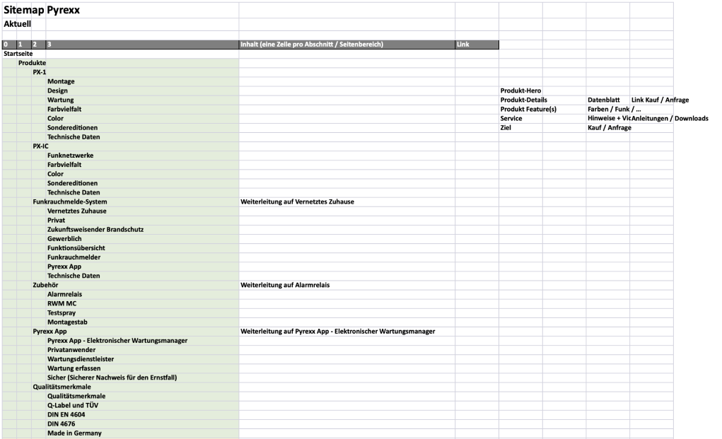
Site map - new version of website : minimalized information architecture with additional functions(icons).

Step 4. Wireframes & Templates
After re-structured, we disccused about template.
remember! one of requirments, "Wordpress"!! so I started to work with low fidelity wireframes and check a design limit with developer.
For added new functionalty (e.g. calendar) research features/widgets.
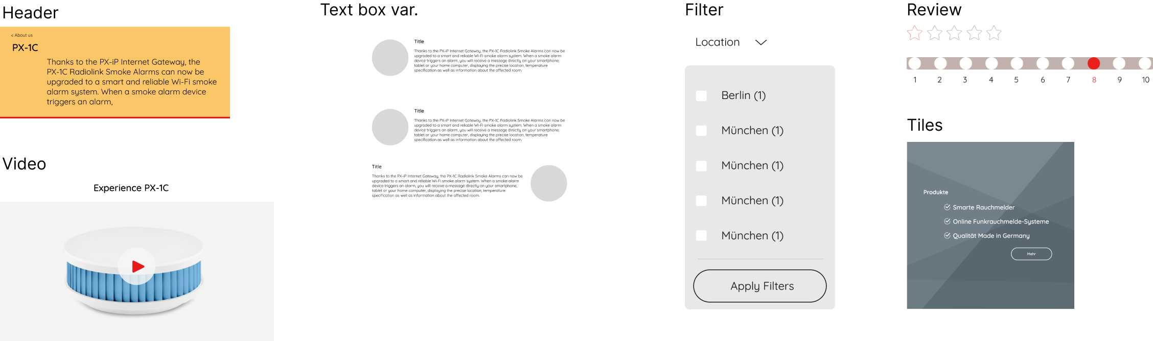
from this step, I used Axure RP.; make Low-fidelity wireframes and disscuss with Engineer and then marketing manager, when she confirmed a part of wirframe, I put the text and Dummy images directly on rough sketch and thenmake high fidelity-wireframes.
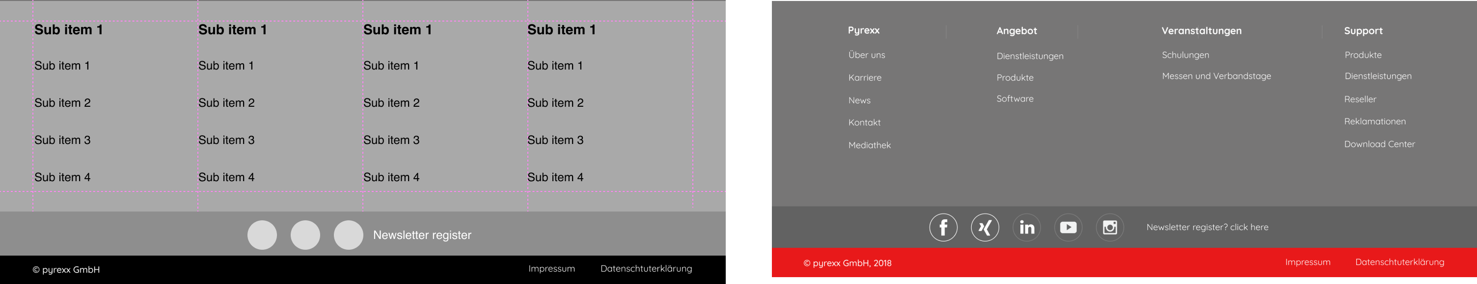
Here I can show examples for Header, Navigation & Footer.
1. Meta menu - AD, search and languages
2. Main menu edit - exchange position : Service and Productsadd
3. New menu item- About us
4. Seperate with menu items and CTA for Quotation portal.
Header & Navigation

Footer
and examples for main body wireframes.
1. Start page
2. Intro page (Start > Menu 1)
3. Detail page (Start > Menu 1>Sub menu detail)
Main idee was "Let's show all available contents in one page".
This UX will help user to understand about structure and easy access to sub page.
Also I designed extra stick bottom button for "Quotation portal" with extra description about CTA.
Wireframe : Start- / Menu intro- / Detail pages